A mental map is a graphical representation based upon a person's point of view. The mental map above shows a depiction of what a Bostonian might think a map of the United States is like.
A hypsometric map represents elevation of a surface map using tints. The hypsometric map above uses tints to show surface elevations of the United States.
An isopleth map shows lines of constant variables, known as isopleth lines. The isopleth lines connect constant variables within a surface map. The maps above are examples of isopleth maps.
A star plot is a graphical representation of a data set over a number of different variables. Plotting the data set along each axis creates a graphic showing how the variable correlates to the axis. The star plot above shows the variable's relationship with letter identification, hearing, reading, writing, and concepts.
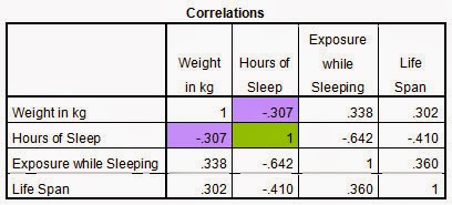
A correlation matrix describes the correlation among a variable within the matrix. In the correlation matrix above, the correlation between weight, hours of sleep, exposure while sleeping, and life span are compared within the matrix.
A similarity matrix represents the similarities between two data variables. The similarity matrix above shows data between Black Maple and Sugar Maple tress in Ohio.
A stem and leaf plot shows the frequency of a data set in a graphical format. In the stem and leaf plot above, the stems and leafs show the frequency of a given variable.
A histogram is a graphical representation of a data set over two variables. This histogram above shows the height and frequency of Black Cheery Trees in the study.
A parallel coordinate graph maps multiple data sets for comparison. In a parallel coordinate graph, a variable is plotted along each axis. with the multiple data sets plots against each other.
A triangular plot show the correlation between any three variables. The triangular plot above shows the relationship between a soil matrix; sand, silt, and clay.
A climograph is an illustration of monthly temperature and precipitation for a selected location. The climograph above shows the temperature and precipitation for Tampa.
A population profile displays a specific population's distribution against a variable. The population profile above plots the 2010 Census data of the District of Columbia against age and sex.
An Index Value Plot shows the correspondence of two variables to measure an index. The Index Value Plot above shows rainfall in Florida, and indicates the index above or below normal rainfalls.
A Lorenz Curve is a type of graph that represents the distribution of a variable and an independent variable. The Lorenz curve shows Household Income and Expenditures.
A Bilateral Graph is a graph that represents more than one variable. In the Bilateral Graph above, the two variables that are being compared are the years 2009 and 2010 US Goods deficit with China.
A nominal area choropleth map projects its data over a nominal area. The nominal area choropleth map above shows changes in the apportionship of the House of Representatives.
A unstandardized choropleth map does not areally averages its data to compare areas of different sizes. The unstandardized choropleth map above shows election returns by state for the 2004 Presidential election.
A standardized choropleth map areally averages its data to compare areas of different sizes. The standardized choropleth map above compares the Hispanic population of each county in Missouri.
A Univariate choropleth maps displays a single unique variable on a single map. This involves creating a unique symbol set representing the variable displayed. The map above it compares the percentage of individuals who suffer from chronic diseases.
A Bivariate choropleth maps displays two unique variables on a single map. This involves creating a unique symbol set representing each variable displayed. The map above it compares total population per square mile and average household size in North Carolina.
Unclassed choropleth maps are very similar to classed choropleth maps; however, unclassed choropleth maps do not have statistics averaged towards each particular color. This map is an unclassed map that shows food democracy legislation in 2007 across the United States.
https://www.e-education.psu.edu/natureofgeoinfo/book/export/html/1553
A classed choropleth maps uses shading or color intensity of the bar for each map classed. This involves creating a classed frequency legend including a frequency histogram and shading. The map above it compares the percent of Hispanic populations in the United States.
A range graded proportional circle maps uses a set number of circle sizes to illustrate the variable. This map shows the amount of TARP money funded by state. The circle sizes are ranges of money paid out during the program.
A continuously variable proportional circle maps shows multiple variables and how they relate to the proportionality of other areas. In these maps a larger circle represents a larger population, and the data within that circle represents multiple variables. This map shows graduated symbols of obesity in the United States in 2008.
DOQQ stands for Digital Orthophoto Quarter Quads. A DOQQ map shows a smaller portion of an aerial photograph or satellite image that have been adjusted to align with lines of latitude and longitude. This DOQQ map shows a region in North Carolina.
DEM stands for Digital Elevation Model. A DEM map models changes in elevations across a surface area. This map is a DEM map of the United States showing changes in topography across the country.
DLG stands for Digital Line Graphic. These maps are digital vector depictions of information on a surface map. This map shows water shed information of the Tampa Bay area.
DRG stands for Digital Raster Graphic. This map this a scanned image of a US Geological Survey Map and is based from the USGS topographical map for Orlando, Florida.
LIDAR stands for LIght Detecting And Ranging. This is a remote sensing technology that measures scattered light to information about a specific target. This is a LIDAR map of a specific area showing water and tree locations.
Doppler radar uses the doppler effect to get velocity data of objects some distance from the radar location. This is done by beaming a microwave towards a target and receiving the signal reflection. This map is a Doppler radar image of Florida.
A black and white aerial photograph is a photograph taken from an airplane used to document how an area looks at a moment in time. This aerial photograph is of Tallahassee, Florida.
An infrared aerial map is used to depict an actual view of an area at the time the image was taken. This map is an infrared aerial map of the Three Forks Marsh area in Florida.
Cartographic animations allow for spatial data visualization over a surface map. It is used to show change in a data set over time. The map above shows the movement of Hurricane Charlie in 2004 approaching south Florida.
A remote sensing map is a map that presents remotely obtained data over a surface map. This map is a remote sensing map that presents the location of inbound aircraft to Miami International Airport.
An statistical map is any map that presents statistical data over a surface map. This map is a statistical map that presents percent of population change by state.
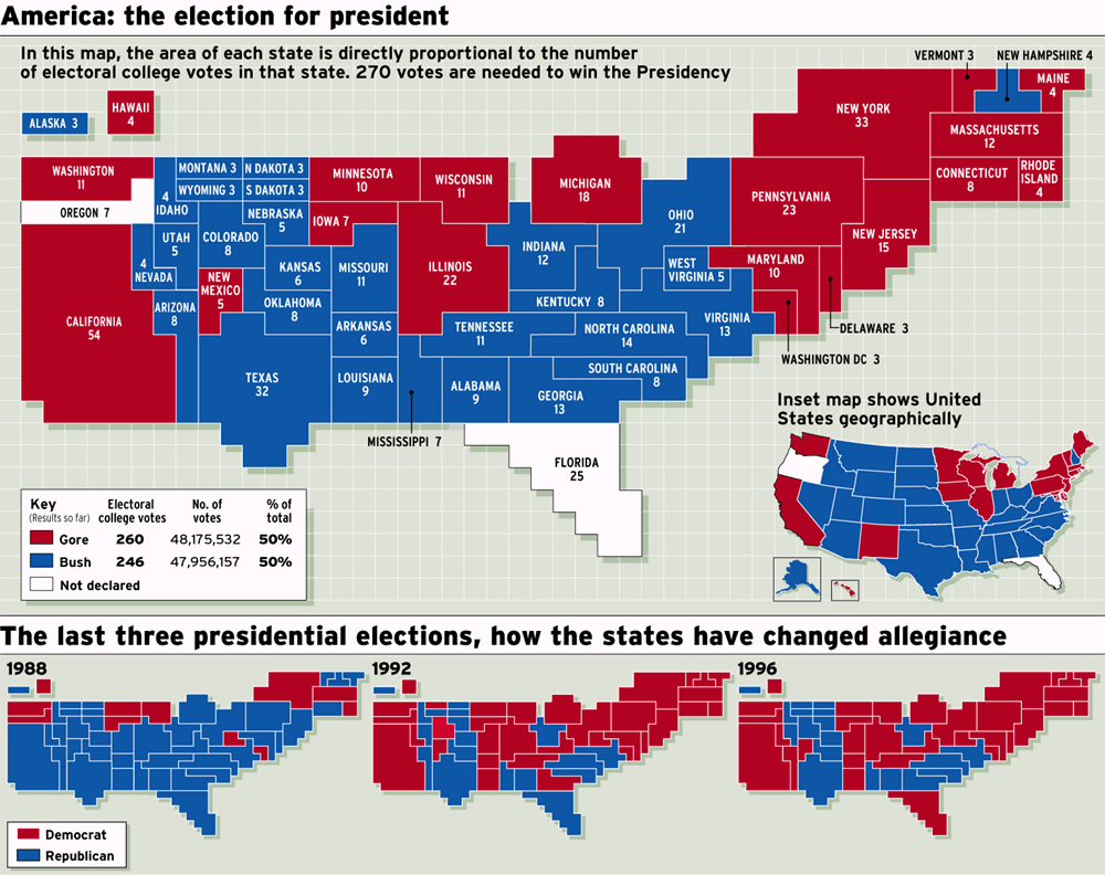
An cartogram map is a map that distorts land area to reflect representation of a variable. This map is a cartogram as the state areas are distorted to the number of electoral college votes the state had in the presidential election.
A flow map is a map that shows movement from one location to another. This map is a flow map that depicts immigration to the United States from around the world.
An isoline map is any map that uses continuous lines to connect points of equal value. Isoline maps are used often in meteorology and geography. This map is an isoline map, that consists of lines enclosing areas of equal wind speeds
In a proportional circle maps, the area of the circle is proportional to a variable. In the map above, traffic fatalities by state are displayed in circles that are proportionate to the number of traffic fatalities.
A choropleth map shows map data shaded in proportion to the variable mapped. This choropleth map shows the percentage of people in Florida who are Hispanic of Latino as of the 2000 Census. The map is a choropleth map as it indicates graded percentages of county population.
A dot distribution map uses dot to represent a symbol spatially on a map. This dot distribution map shows units of population on a map of the United States. The dot distribution on this map indicate 100,000 people.
A Public Land Survey System (PLSS) map provides the PLSS designations across a region. This map shows the PLSS designations across Franklin County, Alabama, indicating the ranges and townships across the county.
A cadastral map provides detailed information about a property within a specific area. This map shows detailed property line information for plots 62 and 63, and as such is a cadastral map of the plots.
Isopach contour lines connect areas of equal thickness. This isopach contour map of the United States shows areas within the county that received equal thicknesses of ash from Mount St. Helens eruption. The isopachs are the thickness of ash received over the region.
Isohyets connect areas of equal rainfall. The isohyets contour map of Florida shows areas within the state that receive equal amounts of average annual precipitation. The isohyets are the amounts of average annual precipitation.
Isotach lines connect areas of equal wind speeds. This isotach contour map shows design wind speeds across the United States. The isotach contour lines indicate the design wind speeds across the country.
Isobars are line of constant data typically projected on a surface map. This map of pressure readings is an example of isobars. The isobars indicate contour lines of constant pressures across the area.


